| | New CAG logo |  |
|
+17Makari SciFiCityCincinnati Mack_attack FrostWolf cowbomber JTPitt mikerollsones JMarv Sigma Golem Mad Dok grotsnik Danny Marc CJ Rob Nathan Rhino-182 Matt 21 posters |
|
| Author | Message |
|---|
Matt
CAG Founder

Posts : 3552
Join date : 2007-08-19
Location : Cincinnati, OH
| | Subject: Re: New CAG logo Wed Feb 13, 2008 5:35 pm | |
| I like the idea, but a very vertical logo doesn't lend itself to the web very well, as vertical space is at a premium. Go too far and we just push more content below the fold.
JT care to try a horizontal sword too? | |
|
| | |
Mack_attack
Neophyte

Posts : 144
Join date : 2008-01-04
Age : 31
Location : Earth
| | Subject: Re: New CAG logo Wed Feb 13, 2008 5:49 pm | |
| I do agree in a way but either way it looks nice besides it sure is taking awile | |
|
| | |
CJ
Captain

Posts : 2334
Join date : 2007-08-20
Age : 49
Location : Harrison OH
| | Subject: Re: New CAG logo Wed Feb 13, 2008 6:15 pm | |
| Eric and I blabbed for a few minutes on the phone...he said the logo would look good on a T-shirt too....I agree! | |
|
| | |
JTPitt
Sergeant

Posts : 890
Join date : 2007-12-14
Age : 41
Location : Deer Park
| | Subject: The swords Wed Feb 13, 2008 6:21 pm | |
| Yea i think i can take a stab at both of the ways the vertical would be better for t-shirts while the horizontal will be better for the website but I gotta find a good sword for em. Once i have both of them done i will post it. | |
|
| | |
cowbomber
Neophyte

Posts : 217
Join date : 2008-01-05
Age : 33
Location : out of this world
| | Subject: Re: New CAG logo Wed Feb 13, 2008 8:10 pm | |
| maybe instead of being up and down we can make it in a diagonal situation... it seems more like a website logo to me. | |
|
| | |
JTPitt
Sergeant
Posts : 890
Join date : 2007-12-14
Age : 41
Location : Deer Park
| | Subject: Scifi Wed Feb 13, 2008 9:28 pm | |
| I have been playing with the sword Idea some the only problem really is making the dice look as though it were part of the overall sword. I think if we go with the sword idea we will need some other way to put 513 in if you still want it but if we want to go simple just the sword and the righting would be good. Please let me know if you have any more ideas. | |
|
| | |
JTPitt
Sergeant
Posts : 890
Join date : 2007-12-14
Age : 41
Location : Deer Park
| |
| | |
CJ
Captain
Posts : 2334
Join date : 2007-08-20
Age : 49
Location : Harrison OH
| | Subject: Re: New CAG logo Wed Feb 13, 2008 11:46 pm | |
| not bad....maybe the font a lil bigger and the one on the dice needs to be shown so the dice in a better angle maybe? | |
|
| | |
Matt
CAG Founder
Posts : 3552
Join date : 2007-08-19
Location : Cincinnati, OH
| | Subject: Re: New CAG logo Thu Feb 14, 2008 4:05 am | |
| I think it is too illustrated for a logo. Not simple enough.
Anyone else jumping in this thread? The typography is pretty poor.
Perhaps try your hand at illustrating a sword... the badly lit 3d render looks a bit tacky. I'll have a go at illustrating one too.
The style of sword is cool, simple enough not to look representative of one type of gaming genre.
One last thing, why do gamers all want swords and guns all over their logo? The main reason for redoing this was to look less creepy and to have a more approachable logo. Not always something people look at and say "hey gamers" but something more professional than a weapon/skull/or eagle (the nazi looking one we used to have). | |
|
| | |
JTPitt
Sergeant
Posts : 890
Join date : 2007-12-14
Age : 41
Location : Deer Park
| | Subject: Re: New CAG logo Thu Feb 14, 2008 6:58 am | |
| I just did this kinda quick over. If you have any particular ideas Matt we would like to hear them. I guess we are all stuck on the idea of gaming in battle terms, but not sure what you mean by making it a little more professional. Thanks for the input | |
|
| | |
cowbomber
Neophyte
Posts : 217
Join date : 2008-01-05
Age : 33
Location : out of this world
| | Subject: Re: New CAG logo Thu Feb 14, 2008 12:40 pm | |
| how about just have a little less detail on the sword but all together it looks awsome to me | |
|
| | |
Makari
Supreme Forum Overlord

Posts : 3291
Join date : 2007-11-10
Age : 46
Location : Milford, OH
| | Subject: Re: New CAG logo Thu Feb 14, 2008 1:11 pm | |
| I like the concept.
I'm sure it is a ROUGH DRAFT. but I really like the idea.
and if we keep the name
Cincinnati ARSENAL Gaming
Then I believe we need to have a weapon of sorts that crosses all boundaries to be in the logo.
The sword is a perfect example. The Dice are fine but maybe the sword sunk into the dice either coming out the other end or just stuck in.
and maybe bow the name under the dice in a smile like form. | |
|
| | |
Marc
Fantasy Moderator

Posts : 2428
Join date : 2007-08-20
Location : Milford
| | Subject: Re: New CAG logo Thu Feb 14, 2008 1:29 pm | |
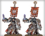
| Keep it simple, simple, simple No weapons No blood No over the top icons I think we were onto it there with the dice. 3 dice (5, 1, 3) in the background With "Cincinnati Arsenal Gaming" across Here are some references :      | |
|
| | |
Makari
Supreme Forum Overlord
Posts : 3291
Join date : 2007-11-10
Age : 46
Location : Milford, OH
| | Subject: Re: New CAG logo Thu Feb 14, 2008 1:47 pm | |
| Should we change the name from Arsenal to Tree huggers then?
I was thinking that this is a Wargaming group that yes has more to it than just wargames but that was the mainstay of the group.
I don't think a sword is too over the top or complicated.
It is a major icon that anyone anywhere in the world can identify it.
We don't need to fluff it up so society doesn't look down on our group.
Although the warbringers logo looked cool.
We don't need to dress ourselves in sheeps clothing just cause some people are afraid of wolves, of course not implying that we are wolves... ok well some of us maybe... but I digest (lol )
We are uber wargaming Geeks stand tall, stand proud, unless a pretty girl is around then suck in that gut and act cool! | |
|
| | |
Matt
CAG Founder
Posts : 3552
Join date : 2007-08-19
Location : Cincinnati, OH
| | Subject: Re: New CAG logo Thu Feb 14, 2008 1:52 pm | |
| We can still make this represent gaming without having a weapon all over it.
The entire idea of reworking the logo was to get away from this kind of thing. Make it look more mature and professional.
It's not about changing so that society accepts us. It's about growing past doing what is the norm within gaming sub culture. Most logos in this area are pretty shitty, choppily made with no design sense.
We can do better.
I agree with you Makari, the warbringers logo is pretty nice (a bit tacky) but it's well done and ambiguous enough to not make us look like the rest of the crowd. | |
|
| | |
Marc
Fantasy Moderator
Posts : 2428
Join date : 2007-08-20
Location : Milford
| | Subject: Re: New CAG logo Thu Feb 14, 2008 2:08 pm | |
| Nice speech Sean.. do you feel better man? Everyone will be tree huggers and gut suckers some day  - makari wrote:
- ...but I digest (lol )
I told you about them fried foods  | |
|
| | |
FrostWolf
Veteran Sergeant


Posts : 1119
Join date : 2007-09-09
Location : lost somewhere in my own mind
| | Subject: Re: New CAG logo Thu Feb 14, 2008 2:34 pm | |
| See I disagree with you guys, A sword is what we use(in game terms anyways) we fight with our games, the eastiest way to represent war games is to use some weopan if we dont we end up looking like some politcaly correct place(which is not in anyway the point of this fourm or we wouldnt be playing table top games) | |
|
| | |
Matt
CAG Founder
Posts : 3552
Join date : 2007-08-19
Location : Cincinnati, OH
| | Subject: Re: New CAG logo Thu Feb 14, 2008 2:40 pm | |
| We can be a wargame forum without having a weapon as our flag. | |
|
| | |
FrostWolf
Veteran Sergeant
Posts : 1119
Join date : 2007-09-09
Location : lost somewhere in my own mind
| | Subject: Re: New CAG logo Thu Feb 14, 2008 2:44 pm | |
| But its a symbol, and yes we can but it is a lot better if we do, symbols should be simple and to the point, but also make the point, a sword or any other weoapon does that | |
|
| | |
Matt
CAG Founder
Posts : 3552
Join date : 2007-08-19
Location : Cincinnati, OH
| | Subject: Re: New CAG logo Thu Feb 14, 2008 2:46 pm | |
| Trust me, I know what a symbol is supposed to do.
I still believe that we won't end up using a weapon (at lest not a fully rendered one) or anything violent.
I appreciate that you want a weapon, but I wouldn't hold your breath. | |
|
| | |
FrostWolf
Veteran Sergeant
Posts : 1119
Join date : 2007-09-09
Location : lost somewhere in my own mind
| | Subject: Re: New CAG logo Thu Feb 14, 2008 2:50 pm | |
| why not just use a 2d one or a 3d one just not make it a the major image of the logo? it still gets the point across and there is less emphasis(spelled wrong Im sure) on the sword | |
|
| | |
Makari
Supreme Forum Overlord
Posts : 3291
Join date : 2007-11-10
Age : 46
Location : Milford, OH
| | Subject: Re: New CAG logo Thu Feb 14, 2008 2:59 pm | |
| I just agree with frost wolf that we don't need to be politacly correct.
It's who and what we are. War what is it good for!!!
Ok so are people going to be able to vote about this or will it be a desicion made by a few or one person? | |
|
| | |
FrostWolf
Veteran Sergeant
Posts : 1119
Join date : 2007-09-09
Location : lost somewhere in my own mind
| | Subject: Re: New CAG logo Thu Feb 14, 2008 3:01 pm | |
| Matt has full Control over the website He has finaly say, | |
|
| | |
Makari
Supreme Forum Overlord
Posts : 3291
Join date : 2007-11-10
Age : 46
Location : Milford, OH
| | Subject: Re: New CAG logo Thu Feb 14, 2008 3:09 pm | |
| Ok then I bow out from opinions on this subject then. My point has been made. | |
|
| | |
Matt
CAG Founder
Posts : 3552
Join date : 2007-08-19
Location : Cincinnati, OH
| | Subject: Re: New CAG logo Thu Feb 14, 2008 3:24 pm | |
| - Quote :
- 2d one
I'll play with that - Quote :
- Ok so are people going to be able to vote about this or will it be a desicion made by a few or one person?
I'll be making that one.
Last edited by on Thu Feb 14, 2008 3:37 pm; edited 1 time in total | |
|
| | |
Sponsored content
| | Subject: Re: New CAG logo | |
| |
|
| | |
| | New CAG logo | |
|